Curriculum Resource Guide: Data Analysis
BACK TO Curriculum Resource Guides
Curriculum Resource to Prepare Students for AA-AAS
1. What is "Data Analysis" and how is it taught in general education settings?
1a.1 The essential knowledge in this content area
Types of Displays of Data Taught in the Common Core State Standards
| Definition | Example | |
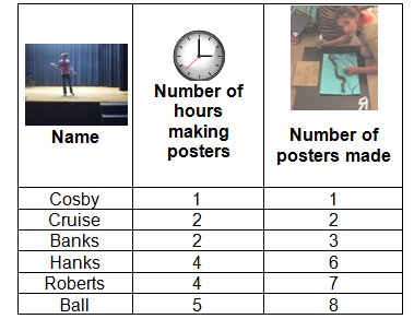
| Tables | Tables are an organized way of displaying numerical data. They do not allow for visual analysis of data which can make it difficult to make inferences about the data displayed. | 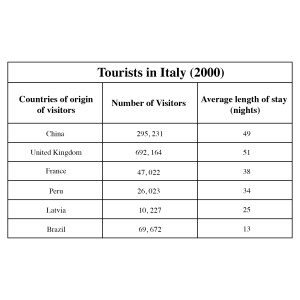
|
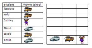
| Pictograph | Pictographs display data using pictures symbols. Usually the pictures symbols represent a specific quantity. Data are usually displayed in rows or columns. Pictographs require a key to allow the reader to interpret the data. | 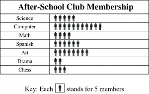
|
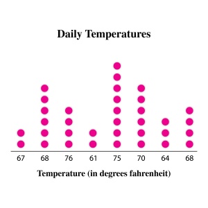
| Line Plot | A line plot is a method of visually displaying a distribution of data values where each data value is shown as a dot or mark above a number line. Also known as a dot plot.
http://www.corestandards.org/assets/CCSSI_Math%20Standards.pdf |
Sample Line Plot for Daily High Temperatures |
| Bar Graphs | Bar graphs are used to compare data. The data displayed is usually categorical (divided into categories). Bar graphs can be horizontal or vertical. The bars provide a visual display of the data that allow for comparisons to be made. When reading bar graphs, it is important to pay attention to the scale of the graph when interpreting data. | 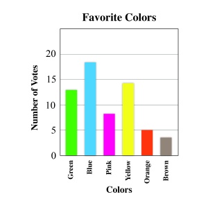
|
| Line Graphs | Line graphs are usually used to demonstrate changes in data over time. The horizontal axis usually represents the quantity and the vertical axis represents units of time. Data are plotted by using the comparison of two variables (bivariate data). Line graphs can be used to observe possible trends in data. | 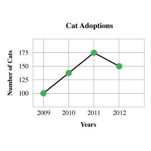
|
| Circle graphs (aka Pie chart) | Circle graphs are used to demonstrate parts of a whole. The circle is divided into sectors, which represent the relative size of each part. Sometimes sectors represent percentages of a whole. The area of each sector in a circle graph is the same proportion to the whole circle as each item is to the total value in the table. | 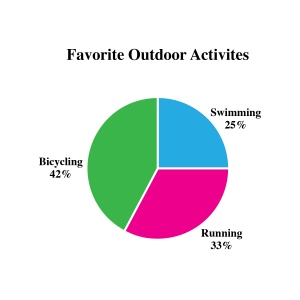
|
| Histograms | Histograms appear similar to bar charts. The main difference is that bars in histograms represent intervals of data and the data are numerical in nature (bars in bar graphs tend to represent categories). Due to the use of intervals, the bars in histograms touch each other to represent the continuous nature of the data. | 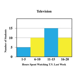
|
| Stem-and-Leaf plot | Stem-and-leaf plots organize the data in a way that displays the shape of the data (the way the data is distributed across the range). The data is organized by place value. The stem contains the largest place values and the leaves contain the numeral in the smallest place value. The leaves are usually displayed to the right of the stem. Another benefit to stem-and-leaf plots is that all individual data are displayed in the graph. | 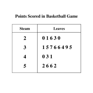
|
| Box plot (aka box and whiskers plot) | Box plots visually display the distribution of data. The box represents the middle 50% of the data. Data are divided into interquartile ranges (ranges that demonstrate 25% of data). The lower quartile (lower 25% data values) is demonstrated by the line extending from the left of the box (this line is called a whisker). The upper quartile (upper 25% data values) is demonstrated by a line extending from the right of the box (also called a whisker). The line inside the box represents the median value of the data set. | 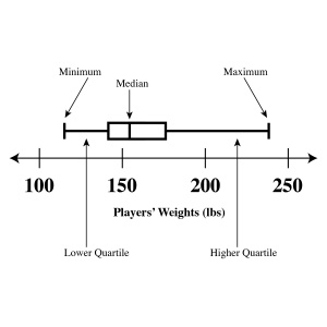
|
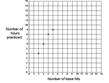
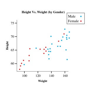
| Scatter plot | A scatterplot is a graph in the coordinate plane representing a set of bivariate data. For example, the heights and weights of a group of people could be displayed on a scatter plot.
http://www.corestandards.org/assets/CCSSI_Math%20Standards.pdf |
|
Collect data and organize into bar graph
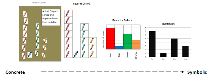
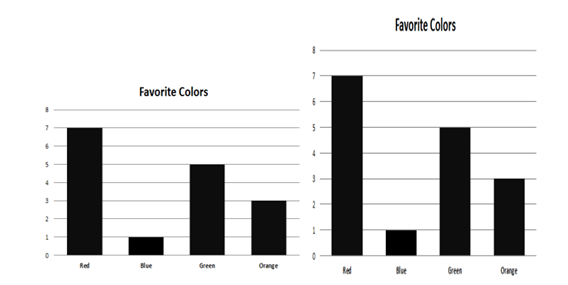
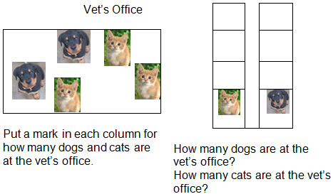
In general education settings, students are taught to pose a question, collect data, organize the data, and interpret the data. Children begin with using concrete objects as their "data." They begin by classifying and sorting the items. Teachers can shape this into graphing behavior by having them sort the items into lines. Then students can begin to use representations of the objects (e.g., photos or line drawings) and place them onto graphs. This is followed by more advanced graphing which includes labeling the graph, shading in sections, developing a key or scale interval to represent amounts, etc. For example, students take votes on their classmates' favorite colors. They get the following results: red – 7, blue – 1, green – 5, orange - 3. Then they are asked to graph the data. Below are examples of graphs moving from concrete to symbolic.
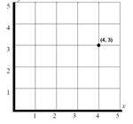
Using ordered pairs to graph given points
Ordered pairs are considered bivariate data. Bivariate data are data that consist of two variables such as miles per hour or numbers of hours studied and grades on the test. Line graphs displaying bivariate data help to show trends over time and enable students to make predictions/estimations by looking at points on the line between the plotted data and estimating the value of the variables represented. Creating line graphs requires students to utilize horizontal and vertical axes in order to plot the data points. This prepares students for graphing on coordinate planes.
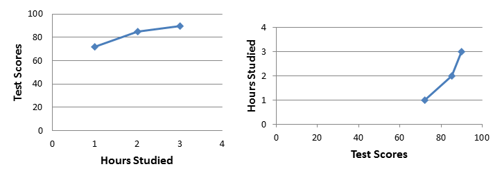
Below are two line graphs using the following bivariate data set: Several students were surveyed on how many hours they studied for the Algebra test. The average test score for students who studied 1 hour was 72%. The average for 2 hours was 85% and the average for 3 hours was 90%. Graph the data.
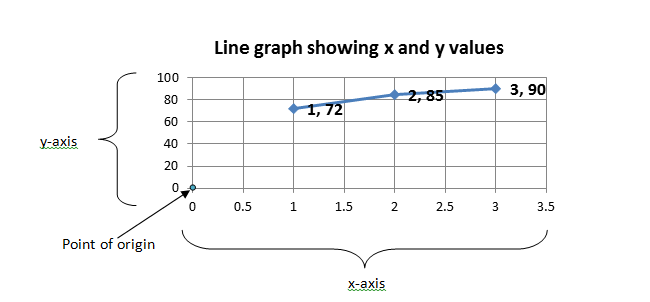
As shown above students may graph the data in two different ways based on their interpretation of the data and the axis where they assign the variables (test scores, hours studied). However, if all the students were told to assign hours studied to the x-axis and test scores on the y-axis or given the following ordered pairs (1, 72), (2, 85), (3, 90) the students should all create the same graph (as shown below). These ordered pairs demonstrate points on the graph corresponding with the x-axis (horizontal axis) and y-axis (vertical axis). The first number tells students how far to move away from the point of origin (zero on the graph or coordinate plane) across the horizontal axis. The second number tells students how far to move away from the point of origin up the vertical axis. So in the example below the first point on the graph is (1, 72). To plot this point you would move horizontally away from the origin towards 1, then move up vertically to approximately 72 and draw a point.
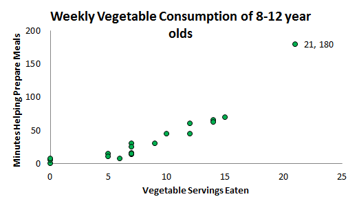
Bivariate data can also be graphed as scatter plots. A scatter plot is a graph of plotted points (i.e., ordered pairs) that show the relationship between two sets of data. In the example below, each dot represents one adolescent's vegetable consumption versus the number of minutes spent helping to prepare meals.
Students learn to analyze scatter plots to describe relationships between the two variables. Based on the plot above students would infer that the more time adolescents spend preparing meals the more likely they are to eat vegetables.
Summarizing data using measures of central tendency and variability
Data sets can be summarized in relation to measures of central tendency (the middle values of the data set). The three measures of central tendency are mean, median, and mode. See examples below using the following data set which compares the number of vegetable servings eaten weekly versus minutes spent weekly helping prepare meals of 19 adolescents:
| Vegtables Eaten | 0 | 0 | 0 | 5 | 5 | 6 | 7 | 7 | 7 | 7 | 7 | 9 | 10 | 12 | 12 | 14 | 14 | 15 | 21 |
| Minutes Preparing | 0 | 5 | 7 | 15 | 10 | 7 | 16 | 14 | 30 | 25 | 15 | 30 | 45 | 45 | 60 | 65 | 62 | 70 | 180 |
Mean, Median, and Mode Mean is the sum of all the values divided by the total number of values. Mean of minutes preparing meals: 0+5+7+15+10+7+16+14+30+25+15+30+45+45+60+65+62+70+180= 701 701÷19= 36.9 minutes Mean number of minutes preparing meals = 36.9 minutes
Median is the middle number in the data set. To find the median, place the numbers in value order and find the middle number. Median of minutes preparing meals: How data are presented:
| 0 | 5 | 7 | 15 | 10 | 7 | 16 | 14 | 30 | 25 | 15 | 30 | 45 | 45 | 60 | 65 | 62 | 70 | 180 |
Data in value order:
| 0 | 5 | 7 | 7 | 10 | 14 | 15 | 15 | 16 | 25 | 30 | 30 | 45 | 45 | 60 | 62 | 65 | 70 | 180 |
Middle number:
| 0 | 5 | 7 | 7 | 10 | 14 | 15 | 15 | 16 | 25 | 30 | 30 | 45 | 45 | 60 | 62 | 65 | 70 | 180 |
Median number of minutes preparing meals = 25 \*Note: if you have an even number of values, find the two middle values add them together and divide by 2 (e.g., middle numbers 24 and 30. 24 + 30 = 54. 54 ÷2 = 27. Median = 27)
Mode is the most often occurring value in the data set. To find the mode, place the numbers in value order and find the most often occurring number(s). Mode of minutes preparing meals: Data in value order:
| 0 | 5 | 7 | 7 | 10 | 14 | 15 | 15 | 16 | 25 | 30 | 30 | 45 | 45 | 60 | 62 | 65 | 70 | 180 |
Mode(s):
| 0 | 5 | 7 | 7 | 10 | 14 | 15 | 15 | 16 | 25 | 30 | 30 | 45 | 45 | 60 | 62 | 65 | 70 | 180 |
The values 7, 15, 30, and 45 all appear twice in this data set. They are the modes. Modes\* of minutes preparing meals: 7, 15, 30, 45 \*This data set would be considered multimodal (more than 2 modes; bimodal refers to two modes).
Variability (Range and Outliers) Range The range of a data set is the difference between the highest and lowest values in the set. Range of minutes preparing meals:
Highest – lowest = range
180 – 0 = 180
The range of minutes preparing meals is 180 minutes.
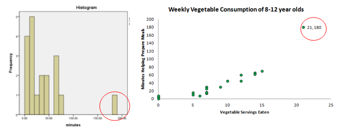
Outliers An outlier is a data value that stands out from others in a set. Outliers are most easily determined by looking at a visual graph of the data. Below are two examples of viewing outliers (circled).
Summarizing data by creating histograms
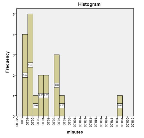
A histogram is a graphical display of data using bars of different heights. It is similar to a bar chart but a histogram groups data values into ranges an uses vertical columns to show the frequencies of the of the data values. The histogram below displays the number of minutes adolescents spend preparing meals per week.
According to this histogram the overall range of the data values is from 0 to 190. The data values are grouped in ranges of 10. This graph can be analyzed to interpret information about the adolescents in this sample duration of weekly meal preparation. For example, five students spent 10 to 20 minutes per week preparing meals. One student spent 70 to 80 minutes. Most students spent less than 1 hour preparing meals.
Analyzing graphs that include two samples or populations
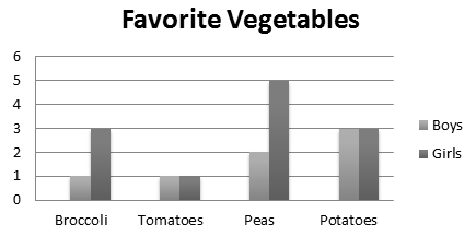
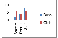
As students learn about measures of central tendency and variability they should be provided opportunities to apply their knowledge to a variety of graphs. Below is a bar graph that includes two samples or populations. This allows students to identify characteristics of each individual group as well as make comparisons between the two groups.
Examples of questions that could be asked about this data set:
- Do more boys or girls like vegetables? [girls]
- What is the mode for favorite vegetables [most commonly voted for – peas]
- What is the difference between the number of boys who voted for broccoli versus girls? [2]
- What is the total number of students who voted for potatoes? [6]
1a.2 Common misunderstandings in this content area
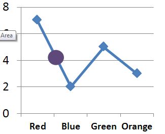
- Students may use the wrong type of graph to display data. Below is an example of the correct use of a line graph instead of a bar graph. In this instance students should understand that all points on a line in a line graph should represent a value. What is the value of the midpoint (see purple dot) between red and blue? A student might answer "4", but "4" of what? This data should have been represented using a bar graph. In order to avoid this misconception, students should be provided practice identifying types of graphs and their purpose. For example, bar graphs tend to display categorical data (data that can only be divided into categories such as colors), whereas line graphs display nominal data (data that can be displayed using numbers).
- Students may not attend to scale when comparing data in two graphs. See the example below. Both are displaying the same data set but one might appear to a student to have more due to the height of the columns. To avoid this error students should be taught to attend to all the features of the graph (in this case, the y-axis values).
- Students may have difficulty interpreting pictographs where each picture stands for an amount greater than one.
1a.3 Prior Knowledge/skills needed (can be taught concurrently)
- Number identification
- More/less
- One to one correspondence
- Same/different
2. What are some of the types of activities general educators will use to teach this skill?
2.1 Activities from General Education Resources
(CCR & Standards for Mathematical Practice Reference Table)
-
 4
4 1
1 3Ask students to collect data (e.g., time students spend playing video games or types of video games played) and then have them select the correct graphical representation to display the data.
-
 1
1 4Have students collect graphs from a variety of sources (internet, magazines, etc.) and sort them by type.
-
 4
4 3Create a scaled pictograph representing classmates' favorite sport.2
-
 4
4 1Use line graph which charts height and weight of an individual to answer questions about the pattern of her growth.2
-
 2
2 1Give students data, such as responses to a survey about favorite dessert, and have them develop a graph with an appropriate scale to represent the data.3
-
 1
1 3
3 1Provide the same data set displayed in two different forms: Bar graph and circle graph. Ask students to compare and contrast the information obtained from each graph.4
-
 2
2 4Provide students with list of numbers and ask them to calculate the average.4
-
 4
4 3Have students collect data about students in their school and compile statistics by determining the mean, median, and mode of student characteristics (e.g., height, age, library use, and distance from home to school).4
-
 4
4 1Ask students to create a circle graph demonstrating how they spend their money.4
-
 1
1 4Ask students to use the internet to find the number of different species of animals housed in five major zoos, and create a bar graph of the data set.5
-
 4
4 2Give students a set of data and ask them to create a line graph to represent the data set provided.5
-
 4
4 2Give students a set of data and ask them to create a stem-and-leaf plot to represent the data provided.5
Links across content areas
- Social Studies:
-
 2
2 4Have students research the average household income for all the states surrounding their own and then create a pictograph using a dollar bill to represent $1,000.
-
 4
4 4Create a bar graph displaying distance from where the student lives to major cities in the United States.2
-
 5
5 4Using election results displaying votes by county have students to calculate the mean, median and mode number of votes for two competing candidates in 10 local counties.5
-
- Literature:
-
 1
1 2Read Help is on the way for charts and graphs by Marilyn Berry.
-
 1
1 2Read The Magic School Bus Inside a Beehive by Joanna Cole and graph an estimate of the number of eggs the queen bee lays in one minute, two minutes, etc. and develop an appropriate scale to match the data.3
-
 3
3 2Write several sentences up on the board that use the term average but communicate different meanings and discuss this with the class. Then explain and discuss the meaning of average when applied to mathematics.3
-
 2
2 2Read Peanut Butter and have students graph the relationship between peanuts and amount in ounces of peanut butter.
-
 3
3 2Ask students to read three different types of genres and count the number of words per minute read over a period of three minutes. Have them graph the data and discuss why some genres may take more time to read than others.5
-
- Science:
-
 4
4 4Have students plant a seed and measure its growth over time and graph the data.3
-
 4
4 4Have students plant a new seed and an old seed and measure their growth over time, graph the data on the same chart, and compare the data between the two seeds.3
-
 1Have students collect and graph data showing the number of tornadoes per year in the United States for the last 5 years.5
-
- Music:
3. What Connectors to the Common Core Standards Are Addressed in Teaching "Data Analysis"?
| Grade Differentiation | Core Content Connectors | Common Core State Standards |
| 3rd grade | 3.DPS.1f1 Develop questions, make a plan for data collection | |
| 3.DPS.1g1 Collect data, organize into picture or bar graph | 3.MD.3 | |
| 3.DPS.1g2 Organize measurement data into a line plot | 3.MD.4 | |
| 3.DPS.1i1 Select the appropriate statement that describes the data representations based on a given graph (picture, bar, line plots) | 3.MD.3 | |
| 3.DPS.1k1 Apply results of data to a real world situation | ||
| 4th grade | 4.DPS.1f2 Develop questions, make a plan for data collection | |
| 4.DPS.1g3 Collect data, organize in graph (e.g., picture graph, line plot, bar graph) | 3.MD.3 | |
| 4.DPS.1j1 Select an appropriate statement that describes the most frequent or the least frequent data point using a line plot, picture graph, or bar graph | 3.MD.3 | |
| 4.DPS.1k2 Apply results of data to a real world situation | 3.MD.4 | |
| 5th grade | 5.GM.1c1 Locate the x and y axis on a graph | 5.G.1 |
| 5.GM.1c2 Locate points on a graph | 5.G.1 | |
| 5.GM.1c3 Use order pairs to graph given points | 5.G.1 | |
| 5.DPS.1c1 Collect and graph data: bar graph, line plots, picture graph (e.g., average height among 3 classrooms, # of boys and girls) | 3.MD.3
5.MD.2 | |
| 5.DPS.1d1 Select an appropriate statement about the range of the data for a given graph (bar graph, line plot) (i.e. range of data) up to 10 points | 6.SP.3 | |
| 5.DPS.1e1 Use measures of central tendency to interpret data including overall patterns in the data | 6.SP.3 | |
| 6th grade | 6.GM.1c4 Locate points on a graph | 5.G.1 |
| 6.GM.1c5 Use order pairs to graph given points | 5.G.1 | |
| 6.GM.1c6 Find coordinate values of points in the context of a situation | 5.G.2 | |
| 6.DPS.1a2 Identify statistical questions and make a plan for data collection | 6.SP.1 | |
| 6.DPS.1c2 Collect and graph data: bar graph, line plots, dot plots, histograms | 6.SP.4 | |
| 6.DPS.1d2 Solve for mean of a given data set | 6.SP.3 | |
| 6.DPS.1d3 Select statement that matches mean, mode, and spread of data for 1 measure of central tendency for a given data set | 6.SP.5 | |
| 6.DPS.1d4 Find the range of a given data set | 6.SP.2 | |
| 6.DPS.1d5 Explain or identify what the mean represents in a set of data | 6.SP.3 | |
| 6.DPS.1d6 Explain or identify what the mode represents in a set of data | 6.SP.2 | |
| 6.DPS.1d7 Explain or identify what the median represents in a set of data | 6.SP.5 | |
| 6.DPS.1e2 Use measures of central tendency to interpret data including overall patterns in the data | 6.SP.5 | |
| 7th grade | 7.DPS.1k1 Analyze graphs to determine of select appropriate comparative inferences about two samples or populations | 7.SP.4 |
| 7.DPS.1b1 Determine sample size to answer a given question | 7.SP.1 | |
| 7.DPS.1g1 Graph continuous data using line graphs, histograms, or dot plots | 6.SP.4 | |
| 7.DPS.1i1 Solve for the median of a given data set | 6.SP.5C | |
| 7.DPS.1i2 Identify the range (high/low), median(middle), mean, or mode of a given data set | 7.SP.4 | |
| 7.DPS.1j1 Make or select a statement to compare the distribution of 2 data sets | 7.SP.3 | |
| 7.DPS.1k1 Analyze graphs to determine or select appropriate comparative inferences about two samples or populations | 7.SP.4 | |
| 8th grade | 8.DPS.1h1: Graph bivariate data using scatter plots and identify possible associations between the variables | 8.SP.1 |
| 8.DPS.1k2 Analyze displays of bivariate data to develop or select appropriate claims about those data | 8.SP.4 | |
| Grades 9-12 | H.DPS.1a1 Design study using categorical and continuous data, including creating a question, identifying a sample, and making a plan for data collection | S.ID.4
S.ID.5 |
| H.DPS.1b1 Complete a graph given the data, using dot plots, histograms, or box plots | S.ID.1 | |
| H.DPS.1c1 Use descriptive stats; range, median, mode, mean, outliers/gaps to describe the data set | S-ID.4
S-ID.5 | |
| H.DPS.1c2 Compare means, median, and range of 2 sets of data | S.ID.2 | |
| H.DPS.1d1 Represent data on a scatter plot to describe and predict | S.ID.6 | |
| H.DPS.1d2 Select an appropriate statement that describes the relationship between variables | S.ID.6 | |
| H.DPS.1d3 Make or select an appropriate statement(s) about findings | S.IC.6 |
4. What are Some Additional Activities That Can Promote Use of this Academic Concept in Real World Contexts?
-
 3
3 5Have students collect nutrition information on their favorite foods from several fast food restaurants and graph the amount of fat and total calories for each of the items. Ask them to identify the healthiest foods displayed.
-
 4
4 3Ask students to collect and graph the average temperatures of weather across the year in the area in which they live; then have them match the type of clothing they need to wear across the year.
-
 4
4 4Have students graph their monthly allowance (or job earnings) and predict how long it would take for them to purchase a desired item. Extend this by having them choose an inexpensive item (such as a t-shirt) and a more expensive item (such as a Nintendo DS) and calculate the difference in time it would take to have the money to purchase these items.
-
 3
3 5Ask students to research the amount of UVB and UVA sunlight that is emitted over time and compare this to what are considered harmful levels of each. Based on this information ask students how often they should reapply sunscreen and/or how long it is safe to stay out in direct sunlight.
-
 1
1 5Have students set a goal time for running or walking two miles. Ask them to time themselves each time they run or walk two miles and predict how soon they will achieve their goal.5
-
 3
3 4Get students to research the cost of living for the city in which they reside. Then have them research the median wages earned for 5 professions they may be interested in pursuing and compare these wages to the cost of living. Ask the students if they will be able to live comfortable on these wages? Will they need to work more than one job?
5. How Can I Further Promote College and Career Readiness when Teaching "Data Analysis"?
Ideas for Promoting Career/ College Ready Outcomes
Communicative competence:
Students will increase their vocabulary to include concepts related to "data analysis." In addition, they will be learning concepts such as: more, less, most, least, same, different, average, about, and graph.
Fluency in reading, writing, and math
Students will have an opportunity to increase their numeracy and sight word fluency while participating in problem solving related to "data analysis" such as addition and division to determine mean and number identification to express mode or median. Writing numerals and developing questions about a data set of visual display of data. Reading and interpreting data displays including legends and labels on graphs.
Age appropriate social skills
Students will engage in peer groups to solve problems related to "data analysis" that will provide practice on increasing reciprocal communication and age appropriate social interactions. For example, students might work together with their peers to survey students in their school and then work together to display the data they collected into an appropriate graph.
Independent work behaviors
By solving real life problems related to "data analysis," students will improve work behaviors that could lead to employment such as a data entry operator. When providing opportunities for real life problems leave some materials out and prompt/teach the students to determine who they should ask and what they should ask for to be able to solve the problem.
Skills in accessing support systems
At times, students will need to ask for assistance to complete activities related to "data analysis" which will give them practice in accessing supports. Students will gain practice asking for tools such as talking calculators, number lines, graphic organizers, and formulas. They can ask a peer to complete the physical movements of the tasks they are not able to do themselves. Be sure to teach students to ask versus having items or supports automatically given to them.
6. How Do I Make Instruction on "Data Analysis" Accessible to ALL the Students I Teach?
6.1 Teach Prerequisites and Basic Numeracy Skills Concurrently: Remember that students can continue to learn basic numeracy skills in the context of this grade level content.
Basic numeracy skills that can be worked on as a part of a lesson relating to equations:
- Number identification
- Counting
- One to one correspondence
- Addition
- Division
- Counting by twos (and other intervals of scale)
6.2 Incorporate UDL: Universal Design of Learning When Teaching Data Analysis
| Some examples of options for teaching Data Analysis to students who may present instructional challenges due to: | |||
| Sensory Differences such as Blindness, Visual Impairment, Deafness, or Deaf/Blindness | Physical Disability or Motor Differences (such as weakness or motor planning difficulty) | Extremely limited evidence of experience/ skill or motivation/attention. | Lack of or extremely limited use of speech. |
Options for Representation
| |||
Provide auditory options
Provide tactile options:
Provide visual and manipulative options to scaffold representation of concepts:
|
Reduce Physical Effort
|
Illustrate through multiple media
Illuminations http://illuminations.nctm.org/ActivitySearch.aspx Math Open Reference http://www.mathopenref.com/ There are many resources listed here: http://www.udlcenter.org/implementation/examples
|
Provide customized display of information
|
| Sensory Differences such as Blindness, Visual Impairment, Deafness, or Deaf/Blindness | Physical Disability or Motor Differences (such as weakness or motor planning difficulty) | Extremely limited evidence of experience/ skill or motivation/attention. | Lack of or extremely limited use of speech. |
Options for Expression
| |||
Vary the methods for response by:
|
Provide options for responses/expression:
Optimize access to tools/ alternatives for responding
|
Provide multimedia options for responses/expression:
|
Provide options for modes of communication:
|
| Sensory Differences such as Blindness, Visual Impairment, Deafness, or Deaf/Blindness | Physical Disability or Motor Differences (such as weakness or motor planning difficulty) | Extremely limited evidence of experience/ skill or motivation/attention. | Lack of or extremely limited use of speech. |
Options for Engagement
| |||
Recruit interest by providing choices:
Increase personal relevance:
Provide tactile options for engagement:
|
Recruit interest by increasing personal relevance:
|
Recruit interest by providing choices:
Provide options for sustaining effort and persistence
Increase personal relevance:
|
Recruit interest with modes of communication:
|
CCR & Standards for Mathematical Practice Table
| Promoting Career and College Readiness | Standards for Mathematical Practice |
